Re the awards issue on the progress page: you say it has been fixed -Thanks. It’s OK as long as I make it small enough, but when I make it large enough to be only one column, there are still no awards thingies. No big deal, but I thought I’d mention it in case anyone else has vision problems.
okay, reposting here as requested by the site owner
okay on iCM 2.x it displays “1 joachimt 532 checks in this list, 63% completed” though interestingly, when I copy and paste I get the following “1 joachimt 63 checks in this list 532 checks in this list, 63% completed 0 toplist checks” (from the sourcecode “63 checks in this list” though don’t see code for the “0 toplist checks” bit)
anyway, on iCM 3.x it displays “1 joachimt OSCAR NOMINEE · NETHERLANDS 9.7K 480 436 48” and I have to hover to see it’s “9733 [total] checks”, “480 favorites”, “436 dislikes”, and “48 lists”. Nowhere does it indicate how many titles from the UNESCO list he’s seen.
Sorry, in list rankings, I really don’t care how many TOTAL favorites, etc a user has - this information is extraneous as it has nothing to do with the UNESCO list. What I want to know is how many titles from ONLY the UNESCO list have been seen - in other words (from v2.x) 532 checks/63% completed
additional comments: Amoreska has noted the problem stems from my using the compact view and I have added
I see the information I want displayed in the ‘normal’ view. However, I still would say “532 checks in this list · 63% completed” is more relevant for the compact view.
I have a question about the Progress page in the new design - what was wrong with the “background bars” (ie the background of the table indicated the percentage of a list watched)?
Moving it to a “loading bar” under the title seems like an unnecessary waste of space (the list titles are small) and makes it much harder to compare list completion at a glance.
Thanks for the great work!
EDIT: I’ve added a quick mockup in case I wasn’t clear. (OK, maybe it is more of a feature request and I’ve posted this in the wrong place?)
1 Like
The first thing I want to know about a director is in how many official lists his or her other films are. In the new beta, looking that up is killing my eyes. Could you possibly find a way to show it more clearly, Marijn? I’d love to see it in at least the same size as the runtime of the films. For instance, you could put it after the genres.
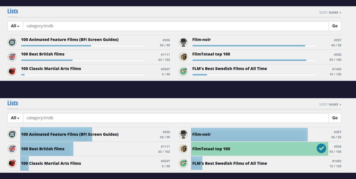
The progress page sorts are scrambled. I applaud the addition of “completion” but at present the sort doesn’t make sense.
1 Like
@marijn I think this should be a priority. The progress page collapses into a single column at a pretty wide width, so this will affect quite a lot of users, particularly those using mobile devices. At the moment, when the progress page collapses into a single column the two columns are interlaced, but to sort correctly the second column should be moved entirely to the bottom.
2 Column view now:
1 6
2 7
3 8
4 9
5 10
One column view now:
1
6
2
7
3
8
4
9
5
10
Whereas one column view should be
1
2
3
4
5
6
7
8
9
10
2 Likes
https://beta.icheckmovies.com/profiles/?sort=awards
This page loads users entire profiles and then hides them under a read more button. This is in my opinion a waste of bandwidth, is there not a way for the profiles to only load upon clicking the read more button?
In any case, the way it behaves now is buggy. Many people have images at the top of their profile. These images load, and then break when profiles are collapsed
see: http://i.imgur.com/LA2lPaI.jpg
Moreover, this also breaks the Read More links for those profiles, as the code seems to get mangled. in that image JF-UK’s Read More link doesn’t work, SanderO’s leads to his progress on Ain’t Nobody’s Blues as the first image that loads on his profile has a link to that page.
Also, it would be better aesthetically if the Read More, and the Read Less when Read More is clicked, button was always on its own line, rather than immediately at the end of the second line of text (last line of text for Read Less).
Also, it would be nice if there was a line with # of official checks and Awards, either right next to the name or on the line below it between the name and the title + country line.
Awesome guys! This is feedback I can work with! Keep it up 
Be careful what you wish for 
https://beta.icheckmovies.com/profiles/?sort=listcount
I’m not sure what in particular about mightysparks profile that causes it, but it doesn’t collapse correctly in compact view. The same issue applies to Eddyspeeder and MariusMariusMarius further down the page.
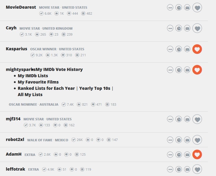
Edit: I think it might be that they’re using bullets in their profile page.
This is a request, not a bug, and it’s not something that is a priority, but it would be nice if filters could be more robust, particularly:
The ability to select multiple filters,
The ability to have negative filters.
When filtering lists, for example: https://beta.icheckmovies.com/lists/
I might want to see all lists that are not personal lists. Or I might want “Neither personal lists nor filmographies” or " Award or country or critics lists only"
A few more comments about the way the progress page collapses:
- There’s an intermediary point where the columns partially collapse, making it so the left and right columns switch:
Image
The above is right about where this begins to happen so I’m guessing at 1200? pixels until full collapse at 1000? pixels.
2 When full collapse does happen the awards disappear but there’s an awful lot of empty space. Image You could certainly fit either the awards or a second column with no awards. This may just be temporary since I know you just removed the awards at this stage because they weren’t lining up correctly, but I hope eventually the collapse is either : Two columns with awards, single column with awards, single column no awards.or Two columns with awards, two columns no awards, single column with awards, single column no awards.
The pull down menu for the user options disappears on the collapsed page. This one: http://i.imgur.com/ixs0X8f.jpg
Which means on a mobile I have no way of getting to my settings page, or the progress page or any of those other links.
On a movie-page, I often check which of my friends have seen a movie. I can’t find that info in the beta. I actually can’t see a list of users who checked it at all. Am I missing something? The only way would be to go through the activity, but that’s not a reasonable option.
This is not about the Beta, but canceling friend requests doesn’t seem to be possible. Someone said they got the error:
[quote]THIS PAGE IS TEMPORARILY UNAVAILABLE
We apologize for any inconvenience. We have been notified about the problem and are working on a solution.
If the problem persists, please contact us: webmaster@studio-donder.nl.[/quote]
I can’t even find the button to click to cancel a pending friend request.
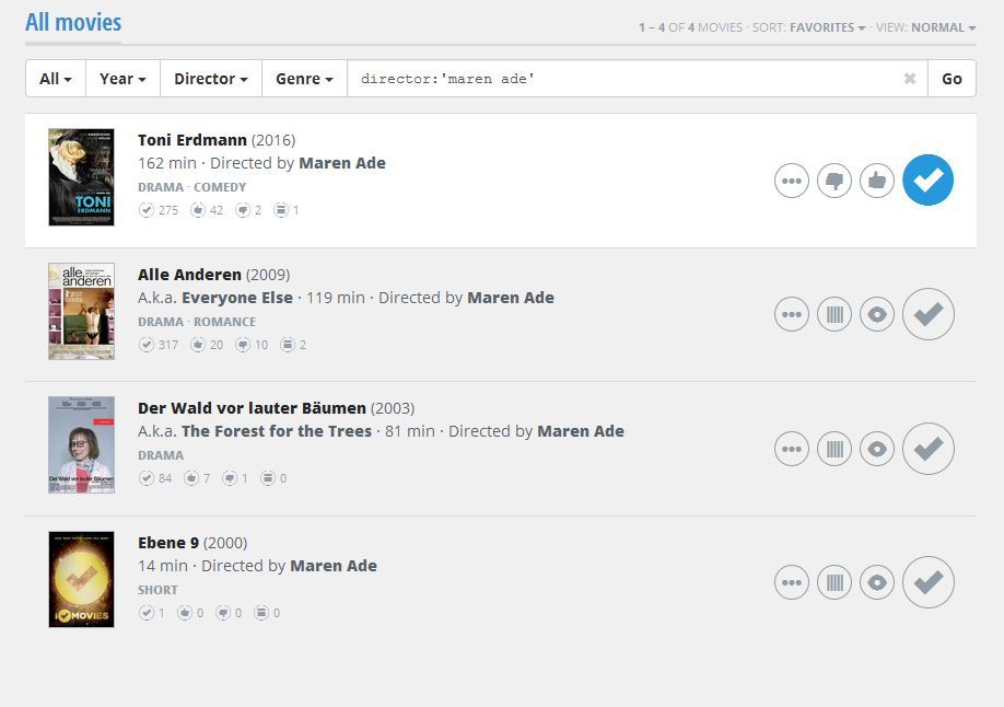
If I want to search for all my unchecked movies of a certain director, I would do this:
- Go to a movie from that director.
- Click on the director’s name. That will bring me here for example.
- Then I select “unchecked” at the left filter.
Unfortunately the director-filter disappears and I have to manually add it again.
Btw, when I filter a director-page on year or genre, it works fine. Great to be able to use multiple filters. The “unchecked” and “checked” filters are probably the most important though, so make sure it doesn’t remove other filters if you use that.
EDIT: I just tried the same with other filters. Same problem. When I go to all movies and then filter on a genre, it gives me a list of all movies with that genre, ordered by favorites. When I add the “unchecked”-filter, the genre-filter disappears, just like a director-filter does.
Reposting from the icmforum thread:
I don’t mind if the checks, favourites, dislikes and checkdate remain as they are now, but total lists should be next to the title and year, similar to how it is now. In my view the total lists is the thing that I sort on most often and is the third most important piece of information after rank and title (and more important than the year).
Also, the medium grey colour used for the genres and stats hurts readability, especially when it’s on the light grey background. All text should either be black or the dark grey of the second line. I would also like to see the mini-thumbs up and thumbs down symbols coloured green and red so they can be told apart easily.
Here’s a mockup how I think it should look:
15 Likes
Not green and red, please. Some of us have a hard time telling those two colors apart. Other than that I’m fine with your suggestions.
1 Like
I use the IMDB links a lot, and it’s a big drag to have following the IMDB link require TWO clicks now.
I’d much prefer having “Add to Watchlist” and “View on IMDB” as “first-level” links, and I’d happily sacrifice seeing the “Favorited” and “Disliked” tallies on that level. I also strongly agree with the others saying the number of official lists needs to be much more prominent.
5 Likes
Maybe like this: http://i.imgur.com/NMLespU.png
On a computer the two clicks for the imdb link isn’t a big deal to me, but it’s really annoying on a touchscreen.
Marjin, please, please, please take ChrisReynolds’ suggestion at heart. The official toplists are the most important and interesting part of iCM. I would really like to be able to see those quickly.
7 Likes