This is the last thing I’m going to change, no more discussion about this please.
1 Like
Well, looks like what I was asking for, so: awesome, thanks. 
1 Like
It looks great now.
Am I the only one bothered by this? I use this extremely often. When I’m searching for rare movies, I’d like to see who checked it, so I can contact people about where they’ve seen a certain movie. This was actually the first and most important reason for me to start using iCM when I discovered it.
3 Likes
I agree. The activity feed can help, but it also shows wishlist and favourites and has different settings than checks so it’s not as useful. Maybe if it had filters for friends and type of activity.
Which brings me to another bug, the activity list for a movie has an option to show the last hour/day/week/month/year, but the pull down menu isn’t working for me (same on the activity feed for lists)so I can only see week by week. I’m on the latest Firefox on PC if that matters.
This will return in a way, but I haven’t had the time to implement it yet.
This. The activity feed is the way to see if a user checked/favorited/whatever a movie. There will be filters for activity type, only friends or all, etc. It will be as usable as the way it’s presented now.
1 Like
Sounds good enough to me. ![]()
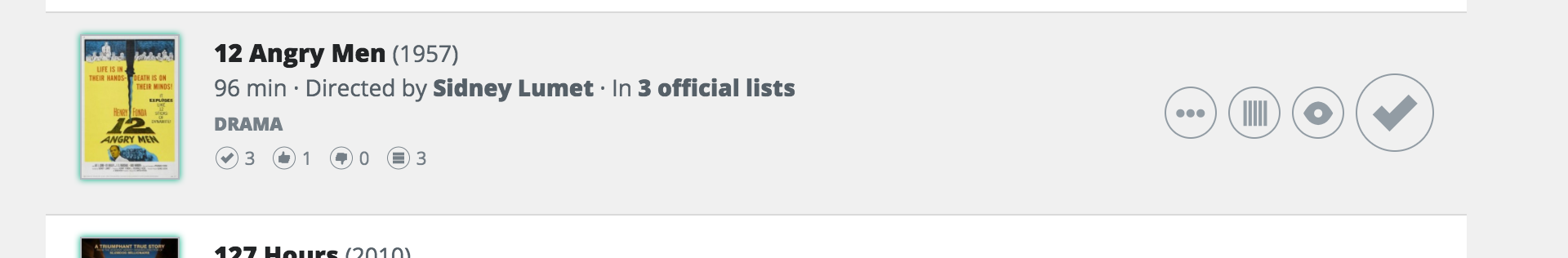
It seems the “new” tab doesn’t work on lists in the new layout. Take the top 250. The number next to “new” shows a 0, but there is actually 1 new movie in the newest update. It shows the correct films when clicking on the tab though.
Ah thanks for reporting that. I’ve logged a bug
I’m currently working on the new profile page. There will be two separate views.
- Dashboard like view if you’re looking at your own profile
- Normal profile view if someone else is looking at your profile
What would you like to see on each of those views? What would be useful information? Your suggestions would be really helpful.
Can someone also ask this on the unofficial forum please? I’d like as much feedback as I can get.
I’ll pass the message on.
Ik gebruik de oude site, maar soms krijg ik onderdelen van de nieuwe interface te zien, bijv als ik op mijn profiel-pagina op Checks klik. Gisteren werden zoekresultaten ook in de nieuwe look weergegeven, maar dat laatste is met het verwijderen van mijn cookies en opnieuw inloggen opgelost. De “checks”-bug is er nog steeds.
Kan dat gefixt worden?
Please post in English, please, although Marijn can read Dutch (just like me, btw ;)).
What you’re describing is not a bug. Marijn links certain things of the site to the new design, so the users get more familiar with it and he will collect more feedback. So at the moment with some clicks you will remain in the old view, with other clicks you will automatically be redirected to the new view.
It’s a shame this was intentional, because I’m not a fan of the new design and I’d prefer to keep using the old lay out. Seeing parts of the beta layout while using the default layout is not a great idea. It looks really messy. Far better to keep the two completely apart and let users decide for themselves if they want to switch over.
2 Likes
I think the idea is we’ll have to switch over completely at some point (soonish?), so better to start getting used to it now and get feedback at this point.
1 Like
One minor design complaint: In the Compact view the a.k.a.'s are written in uppercase which is kind of ugly in my opinion (same withe Word “Official” for movies in official lists).
Another one is that for movies with missing posters, the “empty” poster looks too bright and it comes to the surface more than the actual posters for the movies that have one when looking at a list. I wish it would dissapear to the background more like in the old view.
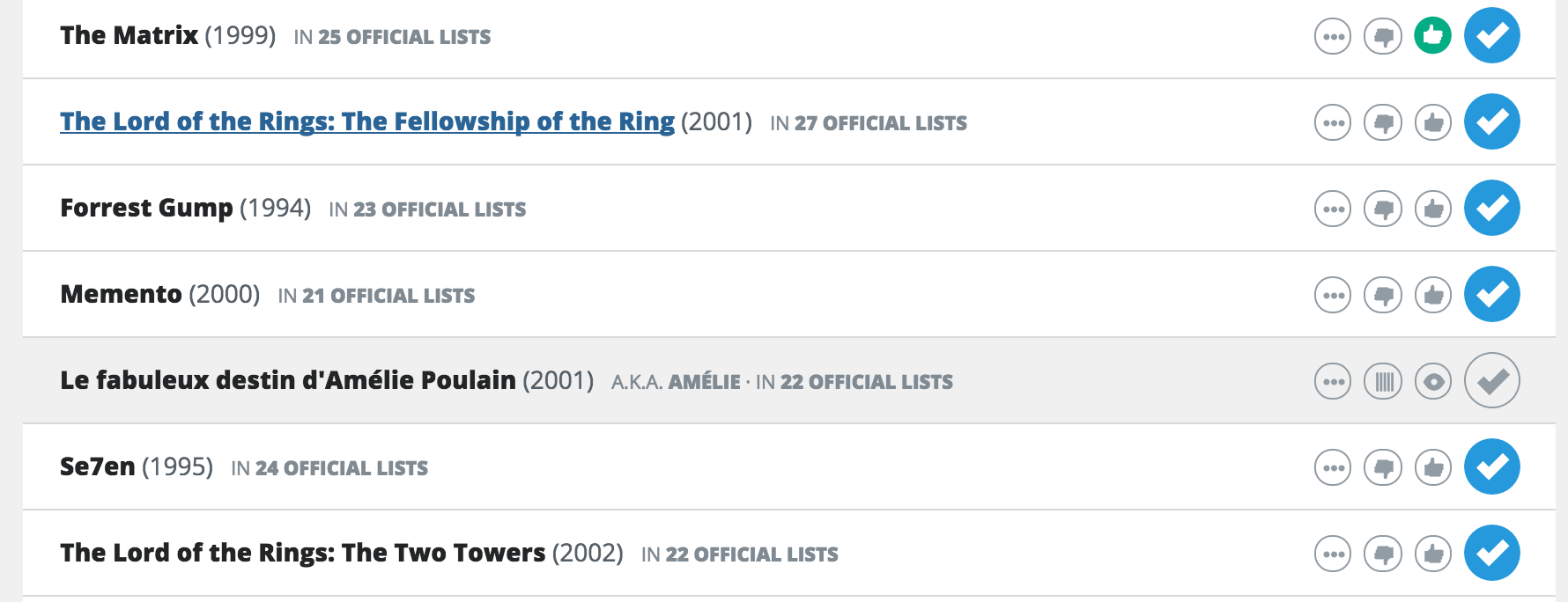
A major one is about the movie pages. The official lists the movie is in was very prominent in the old view. (it’s the first thing I want to look when I click on a movie). Now it looks it’s secondary information and more importance is given to commentary and statistics sections. Also I think the upper part of the page (poster, name other info + the 4 icons in the right) uses too much space which laves less space for the official lists section.
1 Like
Profile page of someone else:
As it is in 2.0…
Stats: Account type doesn’t need to be there. It can be seen by a little star behind the user name. I don’t care about rank title. The rest is useful information. Keep the links to someone’s checks, favs, dislikes, lists.
You and other user:
I hardly look at that. I never compare profiles. So I won’t miss this section. The link to send a message is also at the top. Please keep this quickly available like it is now.
Recent activity:
Not very important, but I often look at it, so it can stay.
Checks:
The part with the last three checks with a link to all checks can disappear. Among the stats there’s also a link to checks. I always click that number when I want to see someone’s checks.
The same can be said about Lists, Awards, Favs and Friends.
Groups will disappear completely in 3.0, right?
I’m finding working with the long lists in the beta VERY sluggish - as in click an item (runtime), go away, come back, click another item (unchecked), repeat. It seems like the entire list is being retrieved each time, even if all we are looking at is the initial 50 items on the list. This aspect feels substantially slower than v2.x on Win7prof/Chrome.
{BTW, my connection speed is limited to
6937 Kbps / 1147 Kbps (down/up)}
1 Like
Stats: I would really like to see both total checks and official checks on user’s profile page (like it shows on the rankings page). Have also seen the change in ranking added to official toplist rankings. Maybe some indication of overall ranking movement would be cool as well - but in addition to just how many ranks have been jumped (-4 or +3), it would be interesting to have a timeframe - how many since last update, in the last week, in the last month, in the last year, since joined. I realize that this might be quite difficult to add at this stage and depends on the underlying code, but thought I’d throw it out while we are talking about stats. Just thought of something else: how about number of checks during those time periods (official vs non) so we get a sense of how prolific a checker one might be. The stats are currently pretty basic/limited - it would be fun to brainstorm other interesting information since it’s clear we like to share that on the unofficial forum as well.
ditto joachimt’s acct type comments but having mouseover text would be useful for those who do care about this info
BUT, I do care about rank title since I’ve moved up to and through Oscar Nominee and am finally approaching Oscar Winner. But since the top three ranks are limited to a few people and most will likely stay within their rank for an extended period, I can see why folks don’t find this very useful. But I’ve looked towards arriving at Oscar Winner someday…
I do really like the editable nature of the About Me type fields. I’m always interested in seeing what people put in that top section when I’m seeing new names/profiles.
I look at much of the rest (and find profiles with hidden data kinda annoying) - wonder if upping the most recent three… to most recent five… might not be more interesting, but it’s not hugely important since we can click and view the longer list easily enough.
As for You and Other User, maybe adding comparisons (later on) like favourites, dislikes, and ways to see the differences. We get general data “You share 4314 movies, 64 favorites and 31 dislikes. Compatibility: Average” but it doesn’t really tell me all that much and it will be quite time consuming to page through 10000 titles to find the 64 favorites we share. Also, side-by-side comparing awards or official toplist progress would be interesting. However, this isn’t really mission critical by any means. Just an idea.
Last, some sites offer the ability to view our own profile page “as others see it” as well. Don’t know if, for example, items one hides (choses not to share) would be visible on one’s own profile. I’ve never experimented with that.