I like the new design, and find it much more mobile friendly. Great work.
Ads sometimes stretch the screen width. The content correctly remains in place, but the menu icon in the upper right can be pushed far off the screen.
I always switch lists to Compact mode on mobile. It might be nice to make this default for mobile browsers or small viewports. Or maybe this is just personal preference and should be left alone (or made a profile setting?).
When lists are in Normal mode, and movies’ name/runtime/director/lists/genre line wraps to multiple lines, it might be nice for the movie poster to expand to fill the vertical space. Without this, the posters can feel small on mobile.
I don’t get instant search results as I type on mobile. I don’t miss the instant search concept, but I miss the ordering used for those results. For example, if I search for “la la land” on desktop, the movie La La Land (2016) is first in the instant results. If I search for it on mobile, it is on page 5 of the results. When I am on my desktop, I appreciate that I can sort and filter the results page. But when I am on mobile, I would prefer basic results sorted however the instant search does it today.
Thanks for the support and ongoing work! Sorry I still have ads, but at least it let me report that.
Personally I hate this unfold feature with hiding (Checked, Unchecked, New),: please consider adding it directly to the All/Year/Director/Genre bar. There is more than enough space for it. It is also lagging (I can choose “Unchecked” almost after 4 seconds in Top 250 IMDB list).
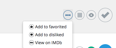
Yeah, we’ve had this discussion earlier about this. I believe the buttons can be all inserted into one line without needing another click to open the extra menu, there’s enough space there and the icons could be made a bit smaller actually:
True! I use “View on IMDB” every time I complete a movie. BTW. unfolding this button is even more lagging than button with All/Unchecked… [Top 250 IMDB]. Why even there is such a big lag here?
I feel that somehow mobile version priority damage the general functionality of this great portal:
progress bar in Lists is 100 times better than this blue thin line in the new design.
you know that the content box is too narrow when bunch of titles suddenly don’t fit in one line!
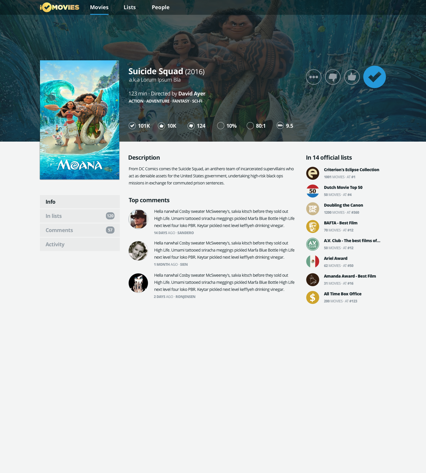
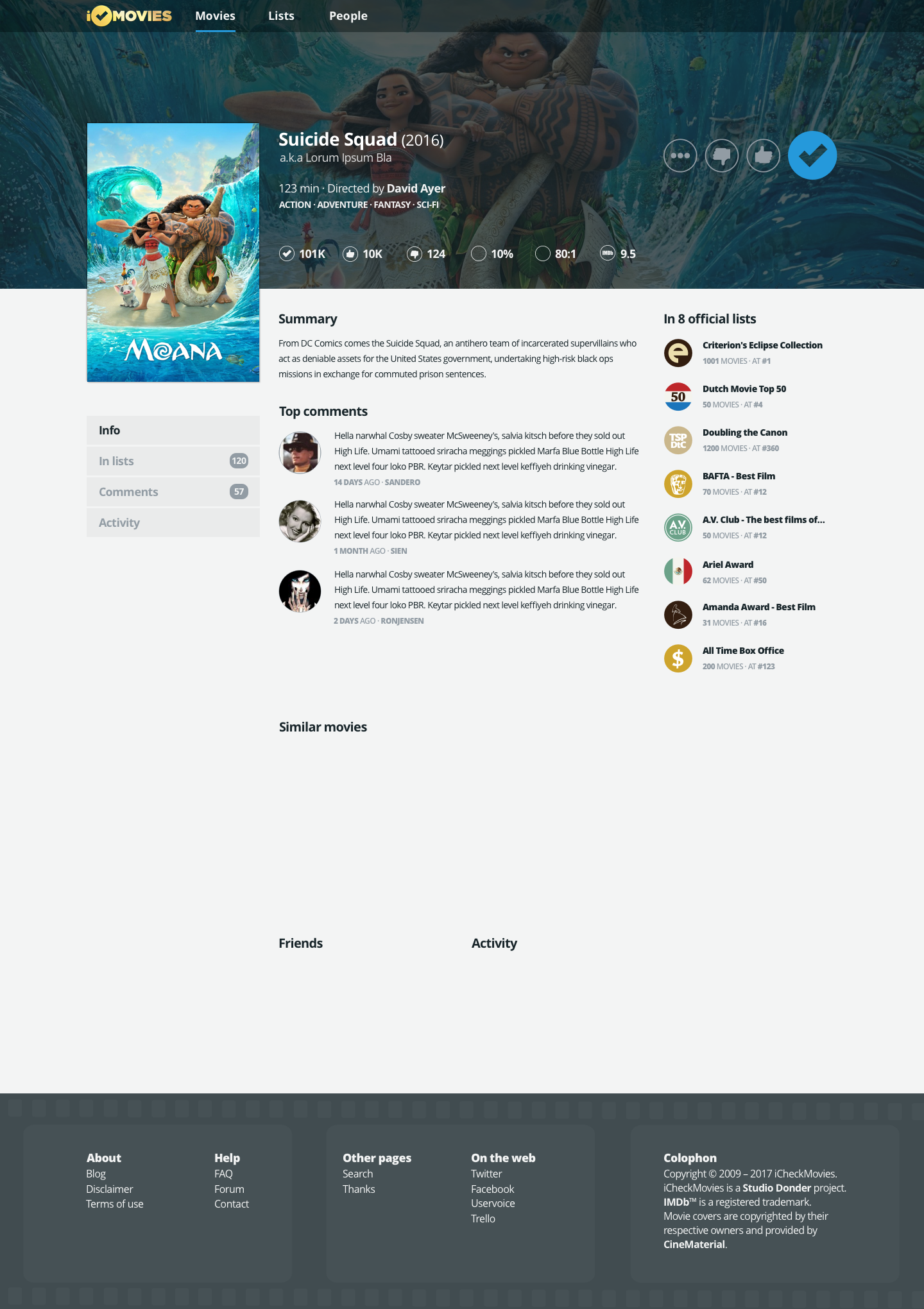
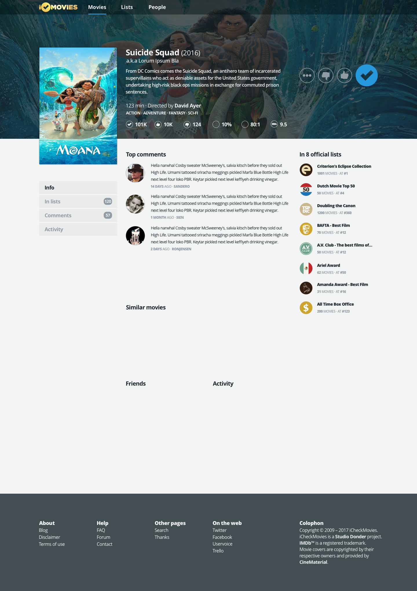
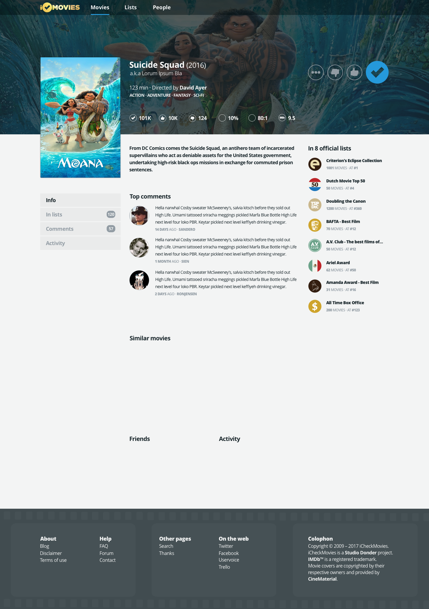
with a new movie page info we are loosing the importance of “In x official lists” <- it is one the first things I’m looking for and in new template I can’t process that in a single look…
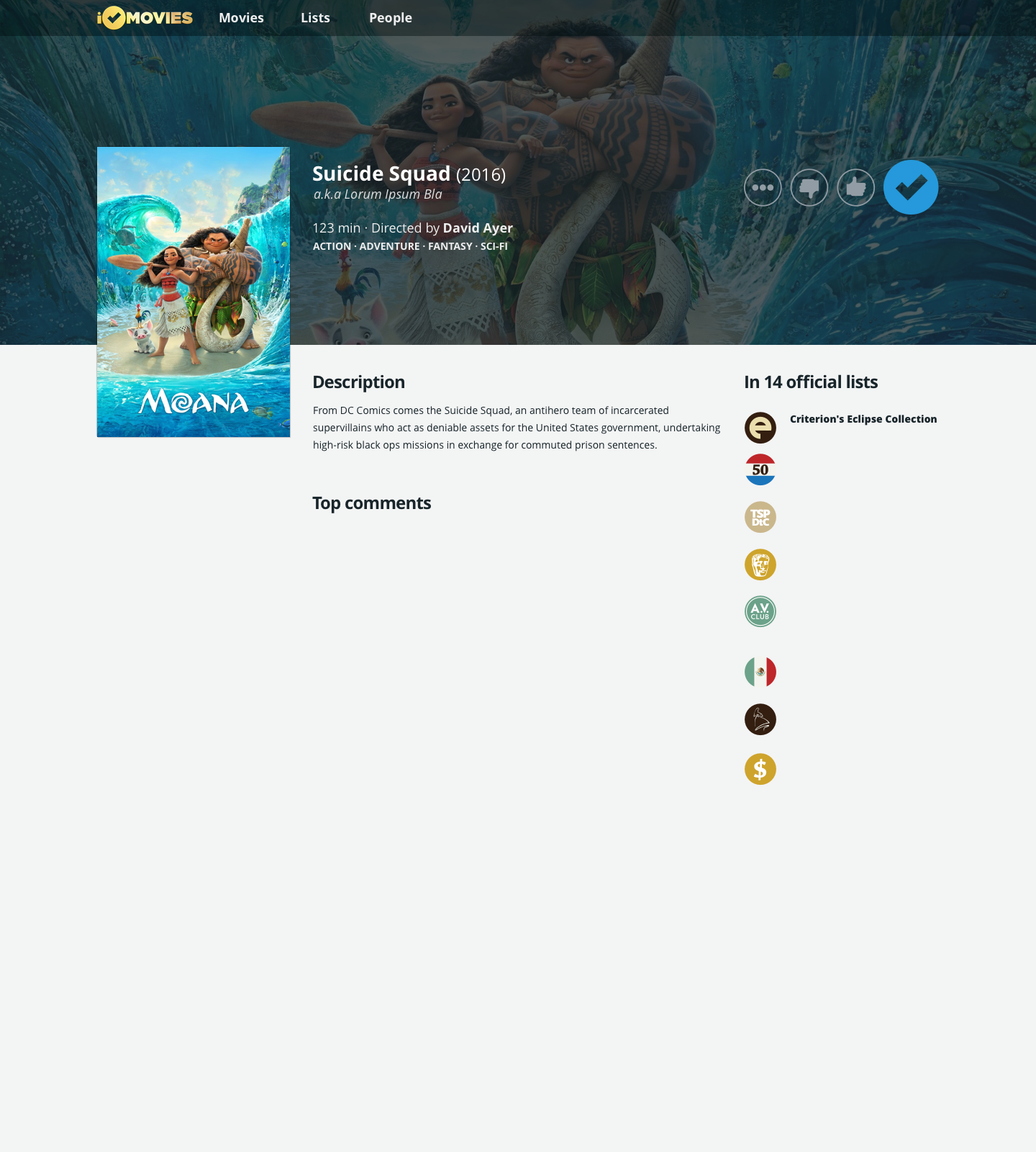
I’d like to see it with all the missing elements (imdb link, checks/faves/dislikes, etc) but I like it. The bigger +cleaner list icons look nice and the background image really helps a lot in making the page feel less generic without overwhelming the information. I also like the AKA having it’s own line and not running into the runtime, it’s much easier to parse both at a glance. Not sure the empty line between them is needed, but I think I’d be ok with or without it.
I like the poster being bigger, but I’m not sure if the way you’ve got it there works or not. It looks fine in that mock up but I wonder if it still will when the other stuff is added in.
Option 1. The description is nice, but it shouldn’t be more prominent than the stats, much less the director and genre. Also the poster extending out looks better when it lines up with the description.
I’d say option 1 is a little more consistent with the rest of the layout (bold headline, regular bread text) but I don’t think option 3 is bad. I guess it depends on how significant the summary is perceived to be.
Personally, I always click through to IMDb if I want to know more about a movie, but I have no clue as to whether my behavior is typical of iCM users.
Yeah, I also prefer option 1. If you want the description to stand out more maybe moving the font size up 1 instead of bolding will look better?
[quote=“Knaldskalle, post:142, topic:53”]
Personally, I always click through to IMDb if I want to know more about a movie, but I have no clue as to whether my behavior is typical of iCM users.
[/quote]Depends on the info. I personally don’t like reading descriptions before watching a film, but if I did it’s the kind of info I’d appreciate being on site rather than having to click through for.
Actually I’m not sure summary is a must as it can be seen on IMDb and it’s not possible to cram all IMDb info anyway, I feel the simpler the better, i.e. less clutter. Also summaries are very different, i.e. one sentence vs a whole paragraph so there’s still a lot of clicking and scrolling.
 Screen Shot 2017-01-28 at 21.10.22